Friday, May 18, 2018

GIS II: Spring 2018 Semester Project

Introduction

I am a geology major interested in mining and the region where I live and go to school, frack sand mining is a hot topic. Frack sand is a component used in the process of  mining oil and natural gas in shale, and unconventional deposit, in a process called fracking.  Also being in this position, I have heard of numerous geophysical and hydrogeologic studies that have indicated that fracking has caused groundwater contamination and earthquakes. This prompted me to create my semester long GIS II project around this contentious issue. 

Background Information

Fracking is the process of injecting water, sand, and a slurry of chemicals at high pressures into shale units to release trapped oil and gas (Figure 1). This has led to a petroleum revolution in the states as there are 32 known oil and gas shale deposits, called plays, in the lower 48 states (Figure 2). The major states involved in exploiting these plays are California, North Dakota, Oklahoma, Texas, Wyoming, and Colorado.

Figure 1. The Fracking process. This figure details the controversial process of fracking. In addition of already being revolutionary, the invention and use of the horizontal drilling pipe has increased oil and natural gas production. Horizontal drilling pipes can even targeted plays up to two miles away. Note the chemical storage tanks and the location of a groundwater aquifer in relation to the shale.

Once the process of fracking has been completed there is a stew of water, oil, chemicals, and sand, called used water, sitting below the surface. This used water is usually pumped out and is then put in either storage tanks, like in Figure 1, or in lined ponds, but pumping does not always remove the liquid 100%. The larger issue is that there is no standard regulation for this used water across state lines. States like Wyoming and North Dakota have strict regulations for the handling of used water  which includes storing the water in storage containers at the surface and then monitoring the tanks with wells to identify and cleanup leaks. In states like Oklahoma and Texas, there is very loose regulations. Used water often sits in leaking tanks or ponds. Sometimes it is not even pumped from the well and left at depth! This can cause contamination in groundwater and in surface water. It has even been suggested as the cause for increasing earthquake events and health issues in these states.

Figure 2. Lower 48 states shale plays. This map details the different plays located in the lower 48. Most of these occur in sinks, called basins. Texas and Oklahoma have very large and abundant plays. The Utica and Marcellus shales in Pennsylvania have been, for the most part, depleted by traditional drilling.  The Antrim, in Michigan, is undeveloped.

Project Development and Question

With this knowledge, I wanted to focus on a state that looser regulations and had earthquake data. I initially chose Oklahoma. However, there was insufficient data. Instead I chose Texas. Texas had plenty of data and still had the looser regulations. My final research question was:
Using GIS software, is there a correlation between the shale plays and earthquake events in Texas? What areas in Texas are at the most risk of earthquake?

Literature Review

This literature review was designed to inform and help guide analysis of our individual project. I wanted to know what have been the impacts of these earthquakes to the state of Texas and if there were any similar projects done. Some of the impacts include:
  • Earthquakes in Texas have costed taxpayers at least $2 million over the past three years
  • Ground and surface water have been found to contain the chemicals used in fracking in large quantities that could cause serious health affects such as cancers, liver and kidney issues, respiratory issues, as well as other negative health concerns.
There has been one similar study to mine that was conducted by the University of Texas-Austin. Like me, they did not have data that contained the location of drilling pads. They instead used railroad spur lines to approximate the drill pad location. Spur lines are small offshoots of larger, main rail lines that are used to connect industries. Frack sand, an ingredient in the fracking process, is often brought to the drill sites by railroad, leading that research team to use this alternative for analysis. For every spur line, they inferred that there would be at least 20-30 drill pads. Their results are shown below. I decided to use this same process for my studies. 

Figure 3. The results of the University of Texas-Austin's research. Their research was much more geology and exploration based, however they employed a GIS software to create the map seen above. Although railroad spurs are not shown in this map, this was the technique they used. This technique resulted in large quantities and trends of drilled wells used in fracking.

Data Analysis and Procedure

I initially wanted to recreate the results from the University of Texas-Austin's study by importing a Texas map that included the counties. I then added a basins shapefile to show the locations of these shale plays. However, the basins shapefile was for the entire USA so the basins shapefile was clipped to the Texas shapefile. I then added a railroads feature class. With my prior knowledge, I knew that the Union Pacific railroad was the largest supplier of frack sand to drill sites. Using the select by attributes function I created an expression that selected only the Union Pacific spur lines, which I then created a feature class from. However, this was for the entire state so I wanted to remove unnecessary spur lines. From research, we know that horizontal drilling can target plays up to two miles away, so a 2 mile buffer was created around the basins shapefile. Any railroad spur that did not fall within or on the buffer or basin shapefile was removed. The editor toolbar was then used to create an extra column in the railroad attribute table using the expression "Union Pacific and Spur line*25." This was done to show the approximate location of drill pads. The results are below.
 
Figure 4. Replica of the University of Texas-Austin study. The red lines show the Union Pacific Railroads spur lines that fall within the buffer or basins shapefile. This was done to allow further analysis to continue. However, note the dissimilarities between this map and the results of the UT-A's work.
At this point I noticed discrepancies between my map and the results of the University of Texas-Austin (UT-A) study. To cross-reference my work, I found a table (not compatible with GIS) that detailed how many wells for oil and gas were drilled by Texas county. After doing the math, my number was nowhere close to the numbers I had from my map. At this point, I decided that I could not continue to do analysis using my map because it was incomplete and therefore inaccurate. I instead decided I would make conclusions based on the location of earthquakes and the basins.
 
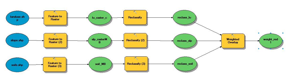
Figure 5. A preliminary model of analysis for the rest of the project. This was adjusted for the railroad spur errors.
For the rest of the analysis, the main tools used were density and frequency tools. Frequency was reported in table format. To ensure accuracy, I wanted to do some steps of analysis in multiple ways. However, I did not have the time. It also should be noted that the Kernel Density Function did not end up being used as the process resulted in an error. All maps produced were reported in the NAD 1983 geographic coordinate system.

Results


Figure 6. This map shows that for earthquake events, that occurred the past 18 years or since fracking has become more common, almost all earthquakes in Texas occur in the shale plays. This means that there is a correlation between fracking and earthquake events. This has the impact to negatively affect human health and cause massive damage to infrastructure.

 
Figure 7. I now took that same map and applied a rank system to show different magnitudes of earthquakes. The results of this map shows that the frequency of earthquakes are more often in the Permian Basin but the largest earthquakes occur in the Western Gulf/Eagle Ford shale.

Figure 8. This last map shows cities with populations of greater than 200,000 in relation to the basins and earthquake events. The earthquakes in the Fort Worth and Western Gulf Basins have the potential to affect the greatest amount of people.

Conclusions

From this research I am confident to report a correlation between earthquakes and shale basins in Texas. There is really no part of Texas that doesn't have the potential to be negatively affected by fracking. The earthquakes in the Permian Basin, although not the strongest, occur the most often and are the deepest. This means that infrastructure would have to be built to withstand repeated earthquake events. The earthquakes in the Western Gulf Basin are the strongest with the potential to cause significant damage to structures and harm human life. Finally, the earthquakes in the Fort Worth and the Western Gulf Basins occur in large, populated errors. This increases the risk for human injury and death. I would hope that these findings would prompt Texas lawmakers or the public to regulate fracking to a safer standard where the negative affects could be largely diminished.

Reflections

If I had additional time, I think it would be interesting to add a hydrologic component to the study and see if the locations of the drill pads are close enough to bodies of water to affect the water quality. I would also like the add the geology and see the impacts of geologic structures on earthquake events. I would have spent more time looking for additional data and finding other studies to base this one off of.

References

Data from this project came from the USGS, Texas-Drilling, the Texas Commission on Environmental Quality, and the Texas Natural Resource Information System.

Sunday, May 13, 2018

GIS II Lab 6: Soil Suitability

In an earlier lab, python was utilized to create a map showing land value in the lower Chippewa River valley. In this lab, model builder methods were explored.  For this lab we wanted to analyze the soil suitability using soil types, land use, and slope feature classes.
The model and processes for this lab can be seen above. As you can see the initial shapefiles were converted to raster and then reclassified using a specific code in their attribute tables. These reclassified rasters were given a specific weight. Soils was given the most weight at 50% and slope the least at 20%. Land use was given a weight of 30% to make up 100. The results of this model can be seen below.
This model builder technique will be used in conjecture with my semester research project. A preliminary model for that can be seen below. More information on this model will be given in my final blog post.


GIS II Lab 5: Semester Project Database

Earlier this semester, we were given a task to think up an independent research topic to complete as our final project. This project would utilize GIS skills that we obtained in this advanced class and in our earlier introduction class.

After weeks of thought and research I came up with the topic I wanted to explore further:

Does fracking impact earthquake occurrence in Texas? How many people could be affected by these disasters?

In my initial research I found that it has been proven with geophysical and hydrologic studies that fracking does cause earthquakes in these basins. However, I want to see if using GIS analysis will support or refute these claims.

To begin this analysis data needed to gathered and collected. Most of this data came from the USGS, the Texas Natural Resource Information System. Supplemental data was obtained from several other sites. Once gathered, the data was compiled into a file geodatabase. This type of geodatabase was used as it has a larger storage capacity and it can be worked on by different individuals, in-case this research was continued. This geodatabase also includes metadata for many of the different downloaded data in a metadata file.

The most important data in this geodatabase includes an earthquake occurrence table which was created into a feature class, the Texas county shapefile, the shale basins shapefile which was then clipped to only represent those in Texas, the Texas cities, and the Texas rivers. It is this data that will be most utilized in analysis. There is supplementary data that may or may not be used.


Figure 1. The completely expanded file geodatabase for my spring 2018 GIS II research project. Note the metadata folders as well as the different shapefiles and feature classes.

The complete project and analysis will be later presented in a final blog post.

Sunday, March 11, 2018

University of Wisconsin-Eau Claire Garfield Ave. Project and Alternate Pedestrian Pathways

In the spring of 2017 work began on the University of Wisconsin-Eau Claire's Garfield Ave. in order to make the campus a little more safe and student and visitor friendly. The figure below shows the initial state of Garfield Ave. before construction and the proposed look for campus when construction is complete.
Figure 1. The initial state of Garfield Ave. on the UWEC campus. Notice the walking bridge stops at Garfield Ave. making students cross the street and the flow of pedestrian and biking traffic very inefficient and dangerous.

Figure 2. The proposed finished product of the project. The street is fully gone with pedestrian and bike only traffic. All rights go to the University of Wisconsin-Eau Claire and their partners for this design model.

In the summer of 2017 and the fall of  2017 the main walking path that connected the walking bridge to the heart of the campus and to academic buildings such as Schneider Hall, Phillips Science Hall, and Davies Student Center was closed off. Pedestrian and bike traffic was directed to walk towards Hibbard Hall and past Zorn Arena and Centennial Hall. Many students and professors were upset to by the diversion and supposed extra walking time. From experience, the alternative path extended the walk from my house to Phillips Hall an extra 5 minutes. This led to the question, "Was the alternate path actually longer or shorter than the normal path and did it have a different time impact?"

In order to ensure accuracy, the path was measured from the start of the walking bridge by the stairs by Haas Fine Arts Center to the doors of Phillips Hall. Initial data was provided by Dr. Caitlin Curtis of the UWEC Geography Department as seen in Figure 3.
Figure 3.  The initial data for this project. The features in this feature class are only point and linear data. Further analysis of this data will need to be altered to be in the correct form.

I proceeded to find the distance for each path, as marked below, using the distance tool. This is the easiest way to find the difference between each route but it also has large user error. The second way to find the difference was to create a geometric network making the lines to edges and the point data as simple junctions. I created a weight distance using more accurate distances from survey data that can be found online after a simple Google search. Using the Utilities Network Analysis toolbar, paths for each route were created and the distance weight applied. The distances between the two methods were averaged.


Figure 4. The top left outlines the alternate path that was used during construction. The top right outlines the normal path taken.

The averaged result between the two methods had the normal path be shorter with an approximate distance of 430 meters. The alternative path was approximately 85 meters (515 meters).

Although this method gives us the distance difference it does not tell us anything about the time each path took. The average human walks about 3.1 miles per hour. Using Excel, calculations were performed to get the time (in minutes) for each distance. 

Figure 5. Table showing the calculations done to get the time, in minutes, for each route. The normal path (430 meters) is clearly shorter than the alternative path.

Although these calculations are useful, it would be even more useful to use the network analysis tools in ArcMap to create a shortest route map to back up these results. Time values were added into the attribute table for the paths shapefile. A new network database was created. The default travel method is automobiles but we need to create a pedestrian method forcing the calculations to use the time values. The shortest route method was selected and solved.
Figure 6. The resulting map of the shortest route method clearly showing the normal path is the fastest.

The results of this analysis is that the Normal Path is not only shorter but faster. These two components were backed up by multiple methods and proved students and professors complaints correct.

All Data for this is property of the University of Wisconsin-Eau Claire and the partners and affiliates. Additional data was found via Google search.

Sunday, February 25, 2018

GIS II: Lab 3, Watershed Analysis

Goals and Background 

The goal of this lab was to use spatial analyst tools to understand watershed analysis and create a map of watersheds in the Adirondack region of New York State. Watershed analysis is a very important concept to understand and be able to use as it is applied in water management, water quality, and conservation to name a few. 

Methods

To begin, data from Cornell University and New York State GIS Clearinghouse was downloaded from the internet. This include a hydrology shapefile an the Adirondak State park polygon. ArcToolbox was heavily utilized in this lab. A 20 km buffer was added to the state park polygon as seen in Figure 1. 
Figure 1. A map showing a 20 km buffer around the state park polygon. The blue lines are the hydrology shapefile from Cornell. These are 2D and have no topographic relation.

An issue with this lab was that not all data was in the same projection. To correct this issue the project tool under data management was used and the projection of the state park shapefile wsa imported. The projection of this shapefile was NAD 1983 Zone 18 N. 

Because a watershed is a function of the topography there needs to be a spatial reference in place. The 30-arc second DEM of North America was imported from ESRI/ArcMap Online. This DEM was also in a different projection and using the transform tool was corrected to be in the same projection. We are only interested in the area of the park and using the clip tool, and new raster dataset was created and the original DEM removed.

The next step is to understand flow direction. Using the flow direction tool under the hydrology tab, nodes are created. Unfortunately, the output contains sinks, or areas that impede water flow. If this map was to be used for watershed analysis the results would be skewed and incorrect so sinks must be filled. The fill tool is used and new nodes are created for flow direction. The result is very trippy and can be seen in Figure 2. 
 
Figure 2. The new nodes are created for flow direction after sinks are filled.  Faint outlines of rivers and streams can be observed. 

Flow accumulation is the understanding of where water accumulates and creates channels. To understand watersheds, flow accumulation must be considered.  Using the flow accumulation tool, a new raster is created.

A source raster also must be created in order to delineate watersheds. This requires a threshold expression. Smaller thresholds yield more watersheds and contain much more detail of in-flowing streams. Larger thresholds yield less watersheds and are more reliant on the larger stream channels. The results figure has a threshold of 50,000.

Figure 3. Watersheds at a higher threshold.

Using the watershed tool,  watersheds for this area are now delineated. At 50k there are 108 different watersheds. The watersheds raster is then clipped to the park boundary buffer. This can be seen in the results section.

Results

Figure 4. The completed map for watershed analysis. The vectorstreams shapefile shows those streams to which contribute for a watershed. These are different from the initial hydrology shapefile as these streams contain a topography factor, are filled, and show accumulation. 

Sources

All materials from this lab are open for public consumption and are property of the University of Wisconsin-Eau Claire, ESRI, Cornerll University, and the New York State GIS Clearinghouse.


Sunday, February 11, 2018

GIS II: Lab 2, Georeferencing

Goals and Background:

The goal of this lab is to review the process of georeferencing using ArcGIS software. This will be done using the ESRI georeferencing course and data as well as data from the University of Wisconsin-Eau Claire. 

Methods

For the historical Eau Claire map, the Mcenterlines shapefile is added first and has a projected coordinate system of NAD_1983_HARN_Adj_WI,_EauClaire_feet and a projection of Lambert_conformal_conic. The historical map has no an undefined coordinate system and projection. This means that the Mcenterlines shapefile is the referenced data for the historical crop. 

For both of this data, the georeferencing toolbar is used. To make creating links easier, a side by side screen is used as seen in Figure 1 below. 
Figure 1. Side-by-side view of the historical, undefined Eau Claire map (right) and the georeferenced Mcenterlines map (left). The study area is consistent between the two maps.

Results


Figure 2. Historical map of Eau Claire, WI overlaying the modern Mcenterlines shapefile (in green). The historical map is at 50% transparency. Note the change in water features, ward boundaries, and street names. Historical maps, like this one, are often drawn in an obsolete local grid system and are not very accurate. There was also issues with georeferencing the historical map and getting it as close to the modern basemap and Mcenterlines files as possible.

Figure 3. Comparisons of the water features in the Eau Claire, WI area. The purple outlined area represents the location of water features today and the light blue represents the location of water features in 1878. Some of these changes could be anthropologically caused while some may be naturally caused. Anthropogenic causes include dams, bridges, and flood barriers to name a few.


Sources

All data came from ESRI and the University of Wisconsin-Eau Claire.

Sunday, February 4, 2018

GIS II: Lab 1

Goal and Background

The goal of this lab was to reintroduce ArcMap software as taught in GIS 1 and use ArcMap as an analysis tool.

Methods

Using the 'Erie' map from the class data folder the attributes tables was closely examined to understand each record and the relationship between one-another. Using the symbology tab under properties for the Erie map two maps were created for the analysis of tract populations and the number of households per tract.  A map for tract populations was created using the sub-tab 'Categories.'  This data can be normalized but it was not in this instance as this map was going to be used to be compared against the number of households per tract map. Under the sub-tab 'Quantities,' a dot map was created for the second map. 

Results


As expected, there were some similarities between the two maps as these variables are dependent of each other. However, there were some interesting differences such as some tracts have a high population but a few number of households. Further analysis of these maps would be interesting if an median age was recorded and could be analyzed or if a land use feature class was added. These further analyses could reveal or disprove any additional trends.

Sources and References

All data used is from the University of Wisconsin-Eau Claire geography department.